
Yarraville Blooms
Visual Identity
Florists are one of those markets segments that have, for the most part, yet to catch up and jump on the consistent-and-cohesive-visual-identity-bandwagon. In my experience, almost all florists/giftshops look almost identical. Some sort of script font done by a sign writer that's never repeated on any other part of their business.
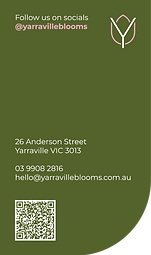
When I was approached to redesign this logo, I advocated for a complete suite of materials and stationary that would help them to sell not just flowers and gifts, but also their brand. One of the consistent design motifs across the entire suite of print materials, and also on their website, is the single rounded corner, mirroring the curve of their logo design.
I have been questioned numerous times about the logo on the ribbon being upside down AND backwards, and the thing is, most people never change their phone camera settings to not take a reverse image when taking a selfie. Having one backwards and one forwards means that however they take and share a photo, one logo will always be the right way.

Primary Logo

Alternate lockup

Brandmark


Reversed Logo


Colour Palette


Stationary

In Practice