top of page
Positive Sparky
Visual Identity


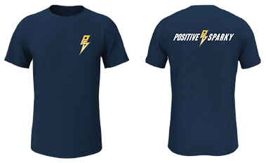
I was originally asked by a colleague to critique the logo and visual identity they had been given by another designer as they were unsure of the final product. With the feedback I gave I also provided a very rough design to suggest some alterations that could be made to strengthen the desired design direction. As a result, they asked if I could create a logo concept for them, and while they did not choose to go ahead with it owing to budget constraints, I chose to flesh the project out as I was just really happy with how cleanly the "PS" monogram came out.

Primary Logo

Alternate Lockup

Monogram

Primary Logo Monochrome

Alternate Lockup Monochrome

Monogram Monochrome


Primary Colours


Secondary Colours


Stationary/Promotional

Van Wrap
bottom of page
